
I'm sure changes will come but that is one of the big reasons I wanted a new template and to build it myself. I can't and won't take all the credit though, Carrie from carrieloves.com, helped me with the Pages Ribbon and gave me a few tips and tricks that proved to be extremely helpful. I couldn't have done it without her help! Thank you so much Carrie!
When I first started up my blog, I used a cute free template I found online and it worked great as a start-up platform for Ami Amore. Over time I did discover quite a few code errors that proved to be frustrating and the design was very limited in what could be changed. Example: the post's comment links on the Home page didn't even show up. Readers had to click each title to be able to leave a comment. Also, I was unable to change any of the fonts or their properties to customize the template to suit my whims of fancy.
Here's how it used to look. Cute, right? Thank you, Mr. Biyan Pasau for the good design! May your skills continue to grow, I appreciated your hard work!

And here's the new: I guess I have a thing for gray. . .

Tidbits about the design:
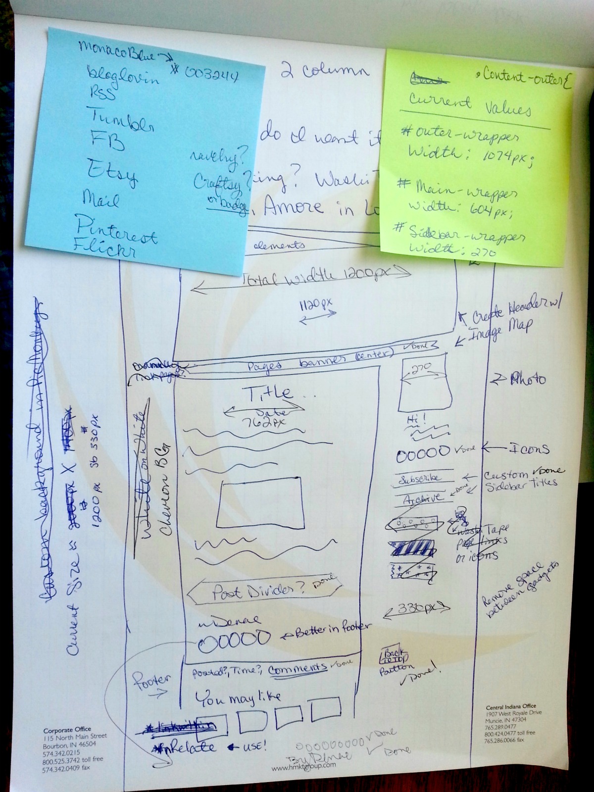
I designed the header, the Pages ribbon, along with the sidebar ribbons to match, all on PicMonkey! It was a little tricky at first but once I got the hang of what shapes and sizes different areas required, it went smoothly.
Chevrons are popular everywhere it seems and blog backgrounds are no exception. I originally wasn't going to use chevrons but when I tried one on for size, it looked perfect! I found this one at tinysea.net. I did lighten it a bit, I wanted a background that would be easy on the reader's eyes.
The social media icons were designed by Carrie, the lady who helped me. She posted free icons in 30 different colors! If you don't have any on your site, you should garb a set of hers! They look and work great!
The other widgets I either found online or signed up for and added them to my layout. The "Followers" widget has been discontinued by Google to make way for Google+. I don't use G+ and my "Followers" gadget was great so I found a work around. All widgets are listed in the template's HTML code, so after digging through the old template, I copied the Followers gadget's code and pasted it into the new template. Worked like a charm!
If you'd like to build your own template or add new widgets and such, start by doing lots of research. Google your questions, you're not the first person to ask them! There are many, many great resources and tutorials for blog design. When it comes to code, practice is the best advice I can give. Practice and a browser add-on called Web Developer to help you learn to identify the coding on your site as well as other sites.
After this experience, I've really come to admire web designers! It's hard work programming a button to work the way you need it to. It's like a complicated puzzle that's all one color. But when it's finished and works, you feel like jumping up and down! I know I did, several times! :D
I hope you enjoy the new look! Let me know if you run into any bugs!

No comments:
Post a Comment
I love comments!! Please leave your thoughts below~ All comments are moderated, I do try to approve them quickly. Thank you!